Magazines
Androstyle Magazine
Androstyle Magazine
8' x 10' androgynous fashion magazine blending experimental typography and editorial design elements. Created as an addition to the Breaking the Binary series.
8' x 10' androgynous fashion magazine blending experimental typography and editorial design elements. Created as an addition to the Breaking the Binary series.
Year
2024
Year
2024
Year
2024
Collaborators
Madeline Rivera, Silas Baxter
Collaborators
Madeline Rivera, Silas Baxter
Collaborators
Madeline Rivera, Silas Baxter
Category
Editorial
Category
Editorial
Category
Editorial
Project Duration
3 weeks
Project Duration
3 weeks
Project Duration
3 weeks
Intro
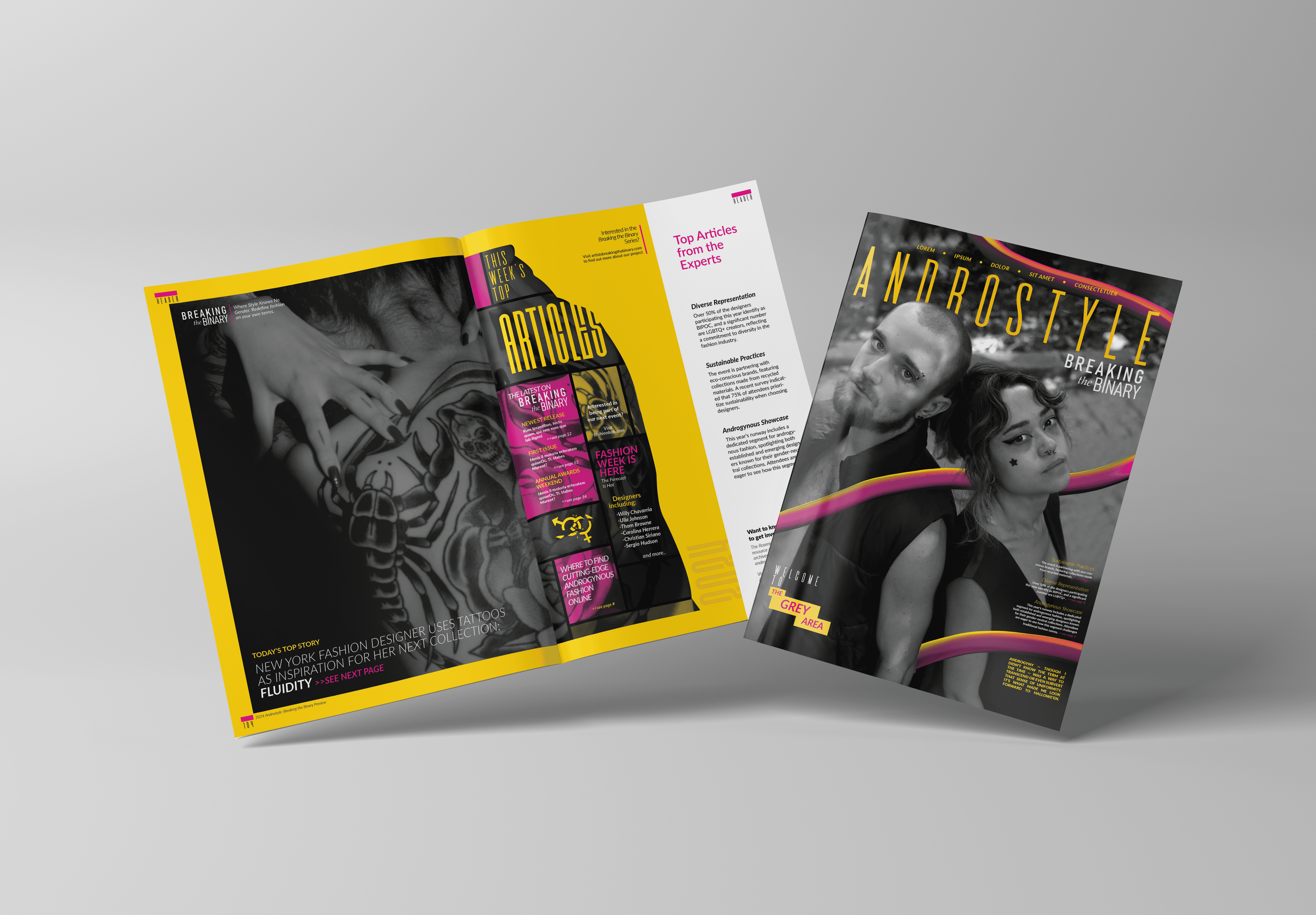
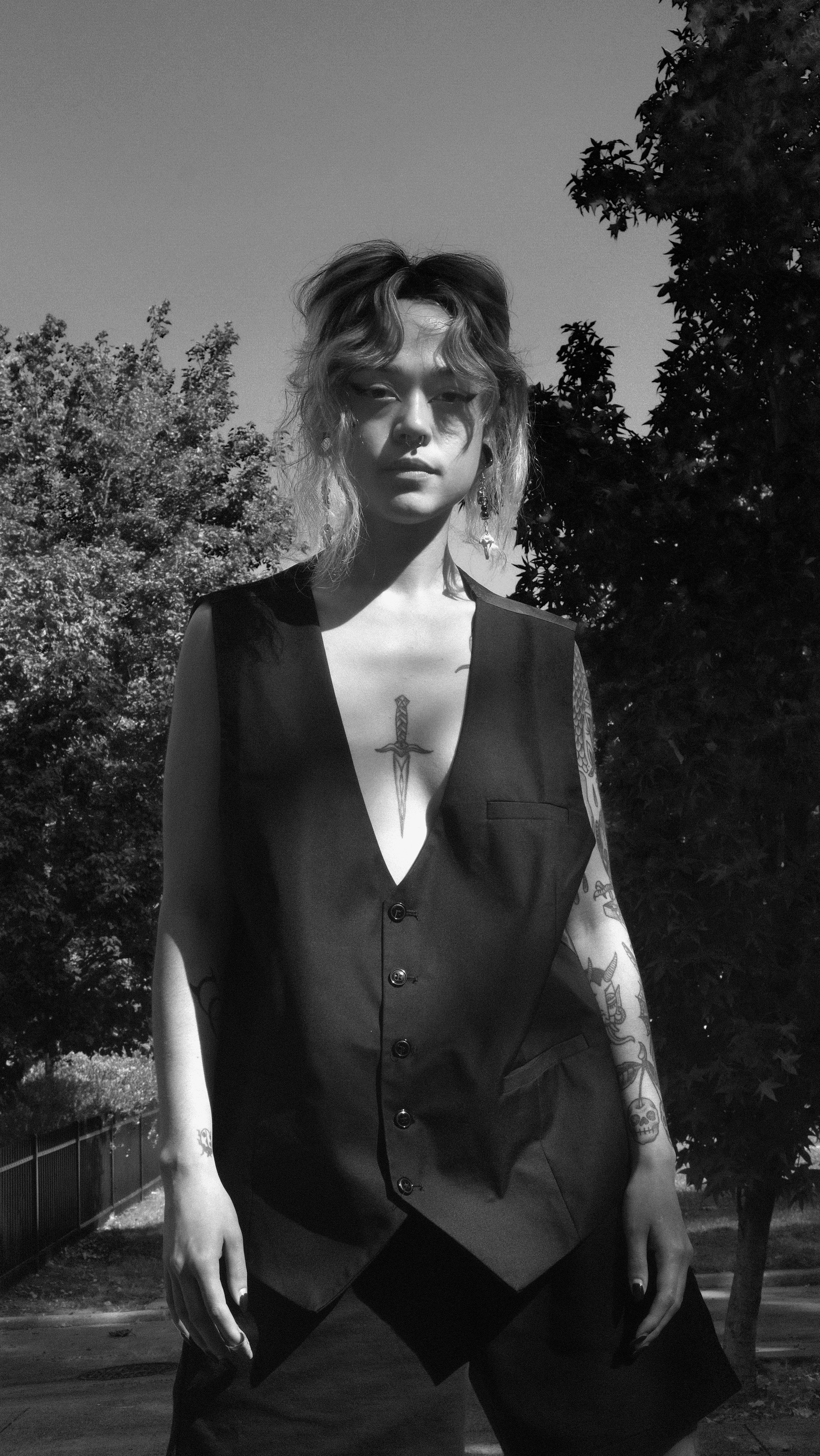
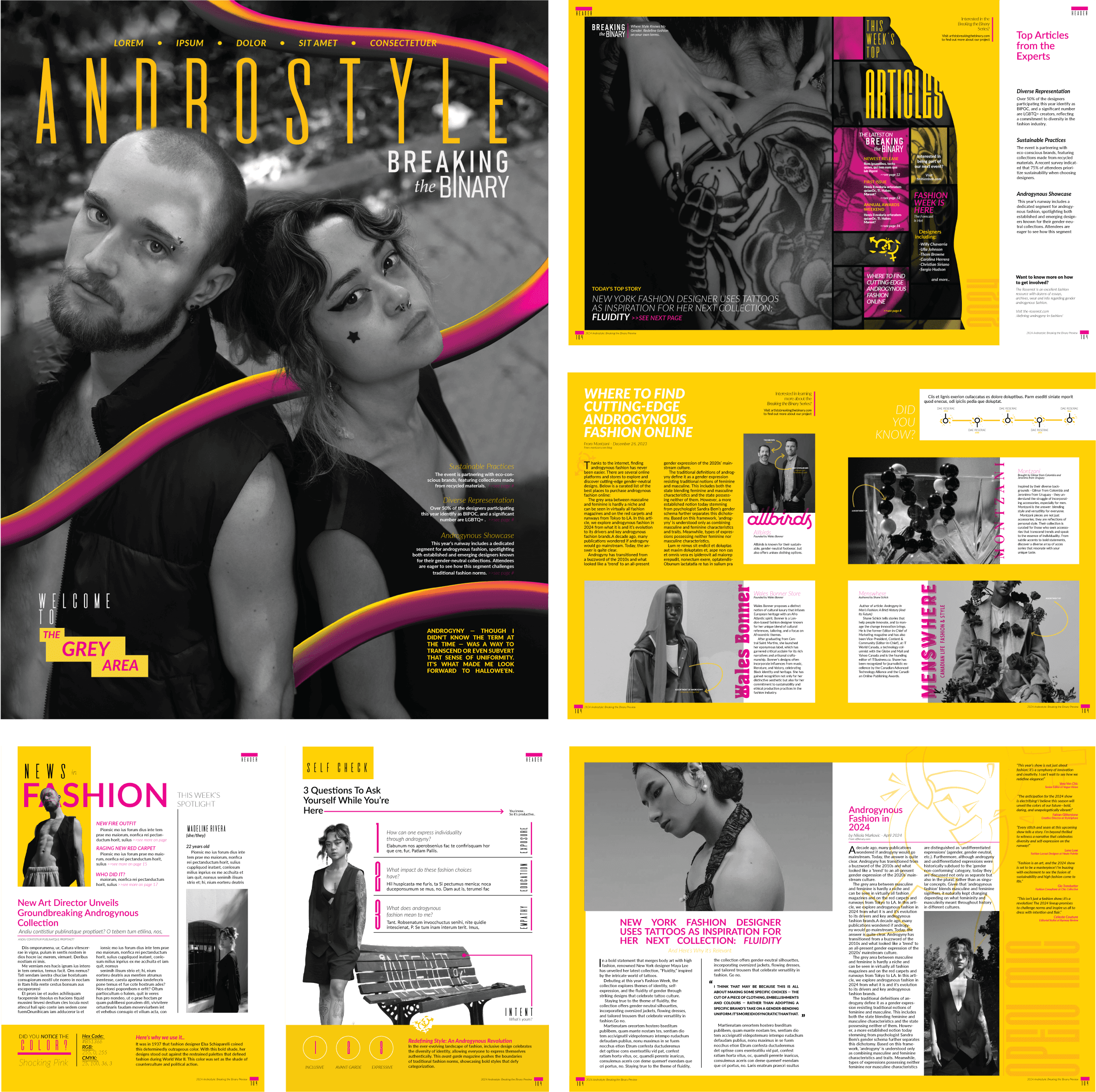
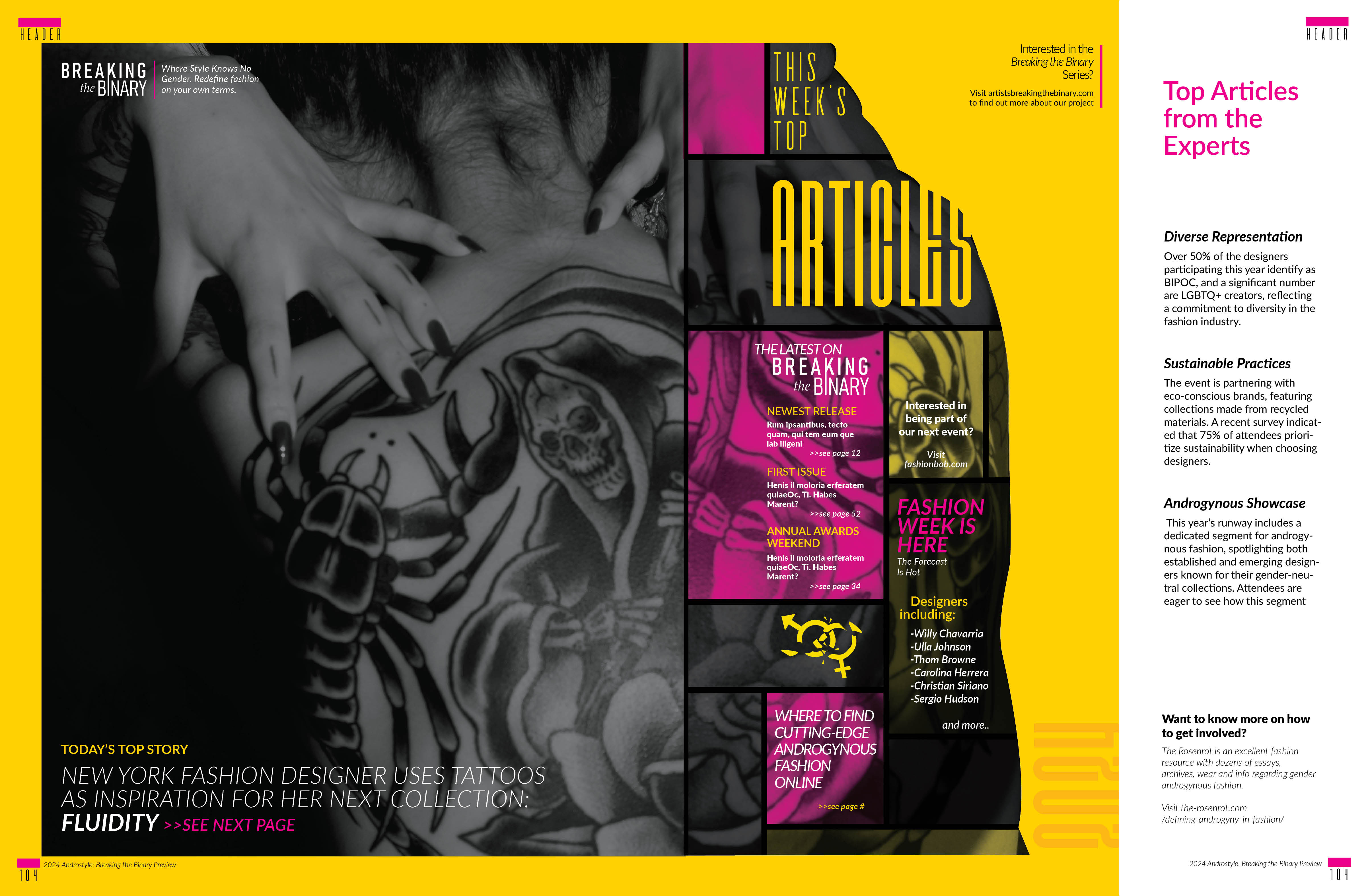
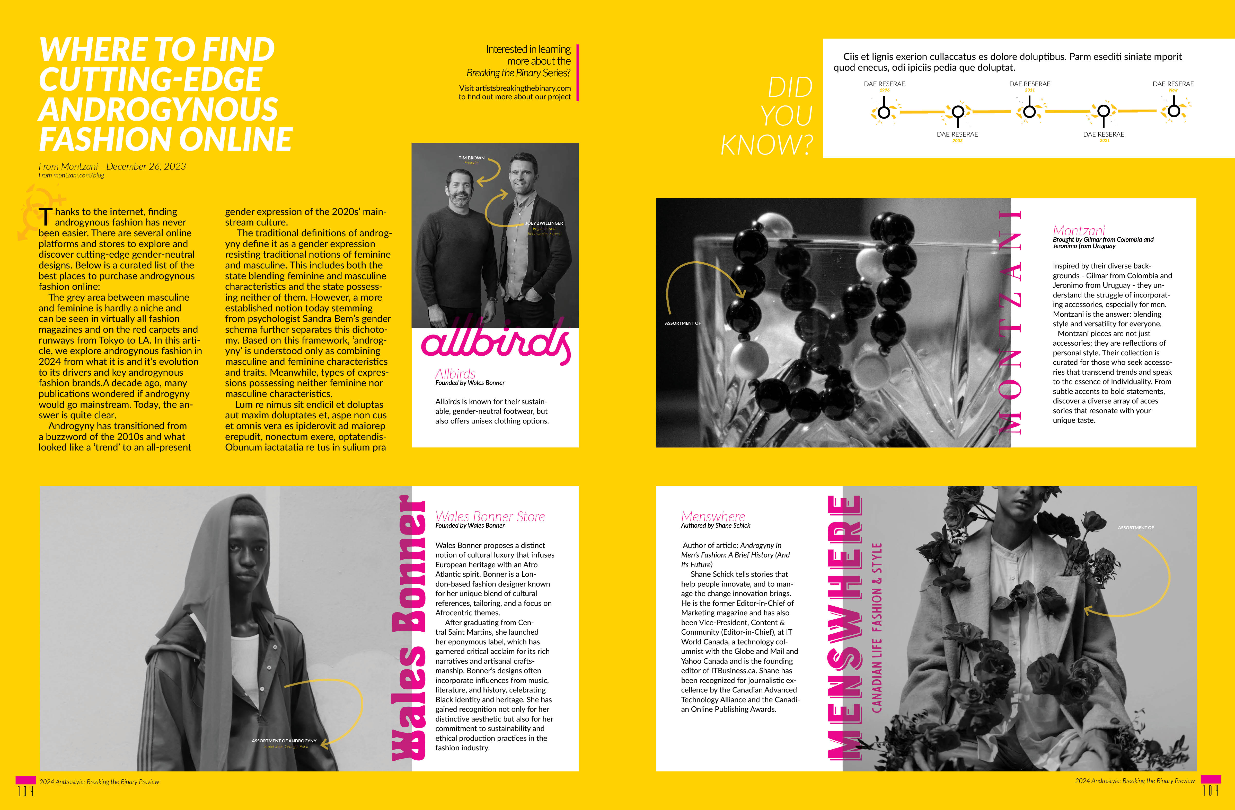
Androstyle is a print magazine celebrating genderfluid and androgynous fashion through documentary photography. The publication centers the voices and personal style of friends within the LGBTQ+ community, creating a space where fashion exists beyond traditional gender categories. Using my own photography and design direction, the magazine presents androgyny not as a niche aesthetic, but as a contemporary expression of identity.

Objective
The core mission was to create editorial content that validates and amplifies genderfluid fashion narratives in mainstream design discourse. The magazine needed to be visually striking enough to command shelf space and reader attention while maintaining editorial integrity around representation and storytelling. I wanted the design itself to mirror the fluidity of identity—moving between rigid geometric structures and organic photographic imagery.

Challenge
The primary tension involved balancing commercial appeal with political purpose. A magazine celebrating gender nonconformity risks tokenization if handled superficially, yet needed accessible design language to reach beyond a niche audience. Photographing close friends required careful collaboration to ensure authentic representation rather than performative imagery. The color palette—high-saturation magenta and yellow gradients cutting through monochromatic photographs—needed to energize pages without overpowering personal narratives. Additionally, the editorial grid had to accommodate long-form features, photography spreads, and curated expert perspectives without sacrificing visual cohesion.
Result
Androstyle emerged as a publication where typography and photography dialogue with equal weight. The geometric framing devices act as visual punctuation, creating rhythm across spreads while keeping focus on the subjects. Featured articles explore androgyny across cultural contexts, sustainable fashion practices, and emerging designers pushing gender boundaries. The magazine successfully positions genderfluid fashion as both deeply personal and culturally significant—neither niche nor trend-driven, but an ongoing conversation about identity, aesthetics, and freedom of expression.
Latest Projects

Magazines
Androstyle Magazine
Androstyle Magazine
8' x 10' androgynous fashion magazine blending experimental typography and editorial design elements. Created as an addition to the Breaking the Binary series.
8' x 10' androgynous fashion magazine blending experimental typography and editorial design elements. Created as an addition to the Breaking the Binary series.
Year
2024
Year
2024
Year
2024
Collaborators
Madeline Rivera, Silas Baxter
Collaborators
Madeline Rivera, Silas Baxter
Collaborators
Madeline Rivera, Silas Baxter
Category
Editorial
Category
Editorial
Category
Editorial
Project Duration
3 weeks
Project Duration
3 weeks
Project Duration
3 weeks
Intro
Androstyle is a print magazine celebrating genderfluid and androgynous fashion through documentary photography. The publication centers the voices and personal style of friends within the LGBTQ+ community, creating a space where fashion exists beyond traditional gender categories. Using my own photography and design direction, the magazine presents androgyny not as a niche aesthetic, but as a contemporary expression of identity.
Objective
The core mission was to create editorial content that validates and amplifies genderfluid fashion narratives in mainstream design discourse. The magazine needed to be visually striking enough to command shelf space and reader attention while maintaining editorial integrity around representation and storytelling. I wanted the design itself to mirror the fluidity of identity—moving between rigid geometric structures and organic photographic imagery.
Challenge
The primary tension involved balancing commercial appeal with political purpose. A magazine celebrating gender nonconformity risks tokenization if handled superficially, yet needed accessible design language to reach beyond a niche audience. Photographing close friends required careful collaboration to ensure authentic representation rather than performative imagery. The color palette—high-saturation magenta and yellow gradients cutting through monochromatic photographs—needed to energize pages without overpowering personal narratives. Additionally, the editorial grid had to accommodate long-form features, photography spreads, and curated expert perspectives without sacrificing visual cohesion.
Result
Androstyle emerged as a publication where typography and photography dialogue with equal weight. The geometric framing devices act as visual punctuation, creating rhythm across spreads while keeping focus on the subjects. Featured articles explore androgyny across cultural contexts, sustainable fashion practices, and emerging designers pushing gender boundaries. The magazine successfully positions genderfluid fashion as both deeply personal and culturally significant—neither niche nor trend-driven, but an ongoing conversation about identity, aesthetics, and freedom of expression.
Latest Projects
Magazines
Androstyle Magazine
Androstyle Magazine
8' x 10' androgynous fashion magazine blending experimental typography and editorial design elements. Created as an addition to the Breaking the Binary series.
8' x 10' androgynous fashion magazine blending experimental typography and editorial design elements. Created as an addition to the Breaking the Binary series.
Year
2024
Year
2024
Year
2024
Collaborators
Madeline Rivera, Silas Baxter
Collaborators
Madeline Rivera, Silas Baxter
Collaborators
Madeline Rivera, Silas Baxter
Category
Editorial
Category
Editorial
Category
Editorial
Project Duration
3 weeks
Project Duration
3 weeks
Project Duration
3 weeks
Intro
Androstyle is a print magazine celebrating genderfluid and androgynous fashion through documentary photography. The publication centers the voices and personal style of friends within the LGBTQ+ community, creating a space where fashion exists beyond traditional gender categories. Using my own photography and design direction, the magazine presents androgyny not as a niche aesthetic, but as a contemporary expression of identity.
Objective
The core mission was to create editorial content that validates and amplifies genderfluid fashion narratives in mainstream design discourse. The magazine needed to be visually striking enough to command shelf space and reader attention while maintaining editorial integrity around representation and storytelling. I wanted the design itself to mirror the fluidity of identity—moving between rigid geometric structures and organic photographic imagery.
Challenge
The primary tension involved balancing commercial appeal with political purpose. A magazine celebrating gender nonconformity risks tokenization if handled superficially, yet needed accessible design language to reach beyond a niche audience. Photographing close friends required careful collaboration to ensure authentic representation rather than performative imagery. The color palette—high-saturation magenta and yellow gradients cutting through monochromatic photographs—needed to energize pages without overpowering personal narratives. Additionally, the editorial grid had to accommodate long-form features, photography spreads, and curated expert perspectives without sacrificing visual cohesion.
Result
Androstyle emerged as a publication where typography and photography dialogue with equal weight. The geometric framing devices act as visual punctuation, creating rhythm across spreads while keeping focus on the subjects. Featured articles explore androgyny across cultural contexts, sustainable fashion practices, and emerging designers pushing gender boundaries. The magazine successfully positions genderfluid fashion as both deeply personal and culturally significant—neither niche nor trend-driven, but an ongoing conversation about identity, aesthetics, and freedom of expression.