Branding
Birds Eye Vision
Birds Eye Vision
Developed a comprehensive digital platform for a shopping mall, including an interactive store directory, event management system, and customer loyalty integration.
Developed a comprehensive digital platform for a shopping mall, including an interactive store directory, event management system, and customer loyalty integration.
Year
2026
Year
2026
Year
2026
Collaborators
N/A
Collaborators
N/A
Collaborators
N/A
Category
Branding
Category
Branding
Category
Branding
Project Duration
2 weeks
Project Duration
2 weeks
Project Duration
2 weeks
Intro
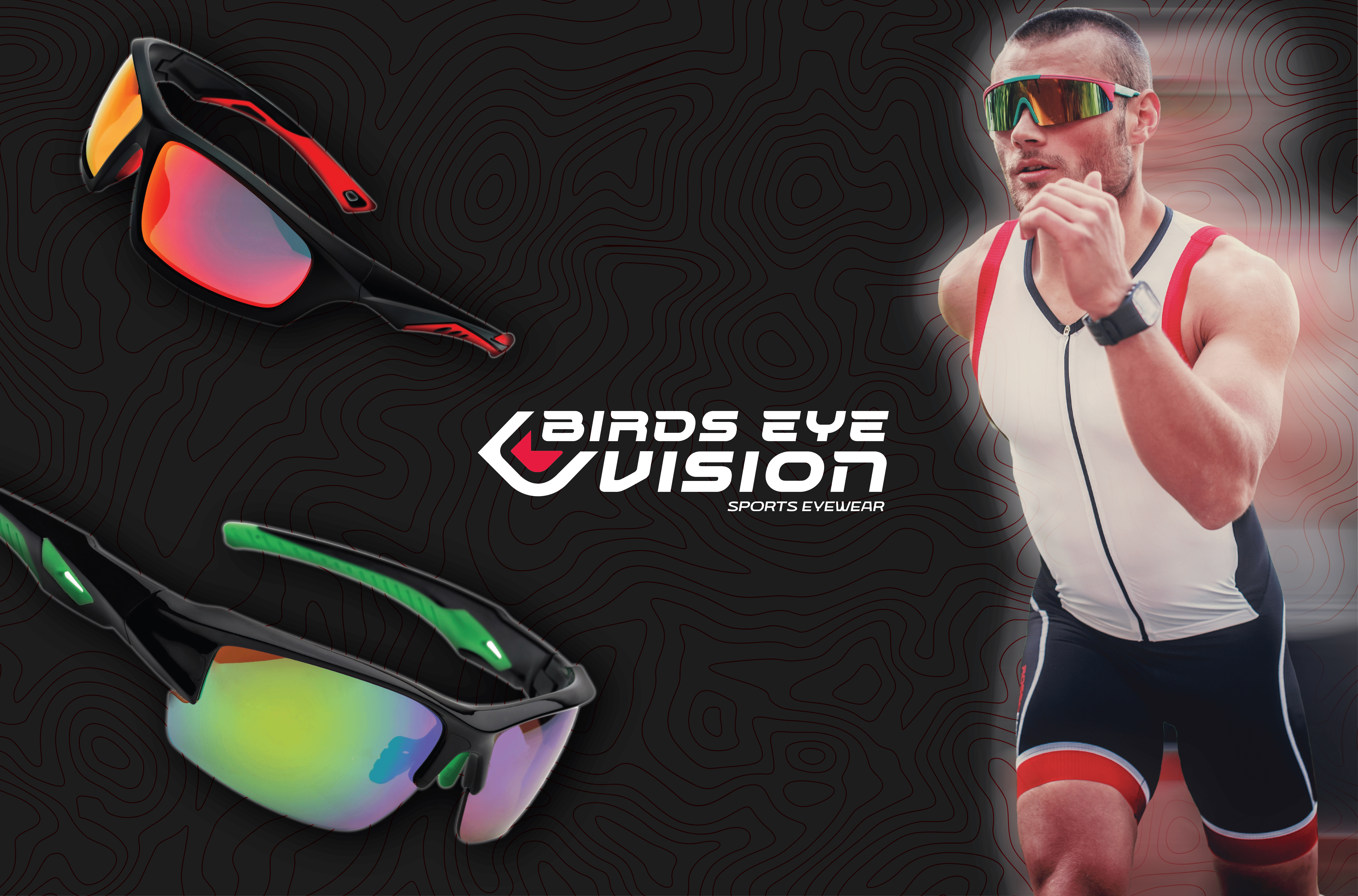
Birds Eye Vision is an athletic eyewear brand designed for performance-focused athletes who demand both functional precision and confident visual identity. The brand identity system merges technical necessity with bold, dynamic aesthetics—creating eyewear that performs as distinctly as the athletes who wear it.

Objective
To establish a cohesive brand identity for a sports eyewear company that communicates performance, precision, and visual clarity while remaining memorable and distinctive in a competitive market. The challenge was translating the concept of enhanced vision into a logo, typography system, and visual language that felt contemporary and athletic.


Challenge
Designing for athletic eyewear required balancing literal and metaphorical representation. The brand needed a mark that could work at multiple scales—from the lens itself to marketing collateral—while conveying speed, focus, and heightened perception. The color palette had to feel energetic without overwhelming, and the typography needed to suggest movement while maintaining legibility in diverse contexts. Additionally, the visual system had to communicate product variety (multiple lens colors and frame styles) while keeping the brand unified.

Result
The final brand identity features a geometric mark rooted in the angular forms of eyewear frames, with the signature red accent suggesting both the eye's focal point and dynamic energy. The typography combines an angular, modern primary typeface with a flowing secondary style, creating tension that reflects the dual nature of precision and motion. The color system—grounded in black, white, and crimson—allows for vibrant lens photography and athlete imagery while maintaining visual hierarchy. The system scales seamlessly across product packaging, digital marketing, and lifestyle photography, establishing Birds Eye Vision as a forward-thinking competitor in performance eyewear.


Latest Projects


Branding
Birds Eye Vision
Birds Eye Vision
Developed a comprehensive digital platform for a shopping mall, including an interactive store directory, event management system, and customer loyalty integration.
Developed a comprehensive digital platform for a shopping mall, including an interactive store directory, event management system, and customer loyalty integration.
Year
2026
Year
2026
Year
2026
Collaborators
N/A
Collaborators
N/A
Collaborators
N/A
Category
Branding
Category
Branding
Category
Branding
Project Duration
2 weeks
Project Duration
2 weeks
Project Duration
2 weeks
Intro
Birds Eye Vision is an athletic eyewear brand designed for performance-focused athletes who demand both functional precision and confident visual identity. The brand identity system merges technical necessity with bold, dynamic aesthetics—creating eyewear that performs as distinctly as the athletes who wear it.
Objective
To establish a cohesive brand identity for a sports eyewear company that communicates performance, precision, and visual clarity while remaining memorable and distinctive in a competitive market. The challenge was translating the concept of enhanced vision into a logo, typography system, and visual language that felt contemporary and athletic.
Challenge
Designing for athletic eyewear required balancing literal and metaphorical representation. The brand needed a mark that could work at multiple scales—from the lens itself to marketing collateral—while conveying speed, focus, and heightened perception. The color palette had to feel energetic without overwhelming, and the typography needed to suggest movement while maintaining legibility in diverse contexts. Additionally, the visual system had to communicate product variety (multiple lens colors and frame styles) while keeping the brand unified.
Result
The final brand identity features a geometric mark rooted in the angular forms of eyewear frames, with the signature red accent suggesting both the eye's focal point and dynamic energy. The typography combines an angular, modern primary typeface with a flowing secondary style, creating tension that reflects the dual nature of precision and motion. The color system—grounded in black, white, and crimson—allows for vibrant lens photography and athlete imagery while maintaining visual hierarchy. The system scales seamlessly across product packaging, digital marketing, and lifestyle photography, establishing Birds Eye Vision as a forward-thinking competitor in performance eyewear.
Latest Projects
Branding
Birds Eye Vision
Birds Eye Vision
Developed a comprehensive digital platform for a shopping mall, including an interactive store directory, event management system, and customer loyalty integration.
Developed a comprehensive digital platform for a shopping mall, including an interactive store directory, event management system, and customer loyalty integration.
Year
2026
Year
2026
Year
2026
Collaborators
N/A
Collaborators
N/A
Collaborators
N/A
Category
Branding
Category
Branding
Category
Branding
Project Duration
2 weeks
Project Duration
2 weeks
Project Duration
2 weeks
Intro
Birds Eye Vision is an athletic eyewear brand designed for performance-focused athletes who demand both functional precision and confident visual identity. The brand identity system merges technical necessity with bold, dynamic aesthetics—creating eyewear that performs as distinctly as the athletes who wear it.
Objective
To establish a cohesive brand identity for a sports eyewear company that communicates performance, precision, and visual clarity while remaining memorable and distinctive in a competitive market. The challenge was translating the concept of enhanced vision into a logo, typography system, and visual language that felt contemporary and athletic.
Challenge
Designing for athletic eyewear required balancing literal and metaphorical representation. The brand needed a mark that could work at multiple scales—from the lens itself to marketing collateral—while conveying speed, focus, and heightened perception. The color palette had to feel energetic without overwhelming, and the typography needed to suggest movement while maintaining legibility in diverse contexts. Additionally, the visual system had to communicate product variety (multiple lens colors and frame styles) while keeping the brand unified.
Result
The final brand identity features a geometric mark rooted in the angular forms of eyewear frames, with the signature red accent suggesting both the eye's focal point and dynamic energy. The typography combines an angular, modern primary typeface with a flowing secondary style, creating tension that reflects the dual nature of precision and motion. The color system—grounded in black, white, and crimson—allows for vibrant lens photography and athlete imagery while maintaining visual hierarchy. The system scales seamlessly across product packaging, digital marketing, and lifestyle photography, establishing Birds Eye Vision as a forward-thinking competitor in performance eyewear.