
Branding
Evan Avenue Designs
Evan Avenue Designs
Brand Identity for EVAN AVENUE, a personal design studio focused on bold contrasting design.
Brand Identity for EVAN AVENUE, a personal design studio focused on bold contrasting design.
Year
2023
Year
2023
Year
2023
Collaborators
N/A
Collaborators
N/A
Collaborators
N/A
Category
Branding
Category
Branding
Category
Branding
Project Duration
5 weeks
Project Duration
5 weeks
Project Duration
5 weeks
Intro
Evan Avenue Designs is a personal design studio focused on bold, systematic design solutions. The brand needed a visual identity that reflected precision, creativity, and a distinctive point of view—one that could scale across applications while maintaining a cohesive, recognizable presence.

Objective
Create a comprehensive brand identity system that:
Establishes a memorable visual language rooted in geometric structure and modularity
Communicates professionalism and creative expertise through minimalist aesthetics
Functions seamlessly across physical collateral, digital applications, and brand documentation
Differentiates the studio through a distinctive typographic and color system

Challenge
The challenge was developing a mark that felt both approachable and sophisticated, avoiding generic design studio clichés while creating a system flexible enough for various applications. The brand needed to work at multiple scales—from business cards to brand guide documentation—without losing visual impact or legibility. Additionally, balancing a bold color palette (gold and black) with neutral tones required careful hierarchy and intentional spacing to prevent visual oversaturation.

Result
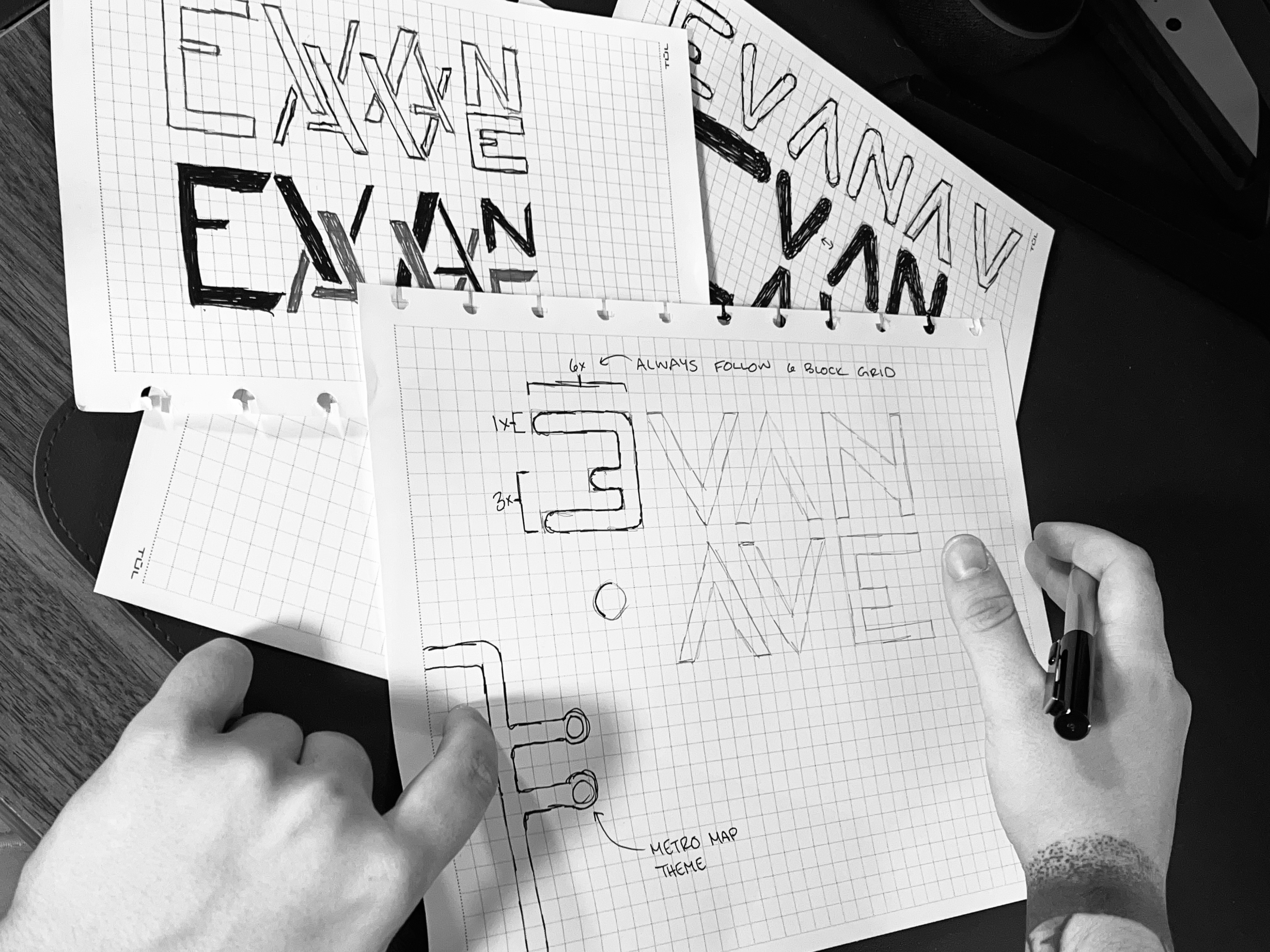
The final brand system centers on a grid-based logo utilizing a 6×6 square structure, allowing each letter to maintain consistent proportions while creating distinct variations (straight-corner and rough-corner typefaces). The gold and black color palette creates strong contrast and presence, while the comprehensive brand guide ensures consistent application across all touchpoints. The modular approach allows the mark to adapt—appearing as full wordmarks, submarks, or stacked configurations—while the supporting typography (Highgate) and systematic layout conventions establish visual authority. The result is a cohesive, scalable identity that distinctly represents the studio's methodical and creative approach to design.
Latest Projects

Branding
Evan Avenue Designs
Evan Avenue Designs
Brand Identity for EVAN AVENUE, a personal design studio focused on bold contrasting design.
Brand Identity for EVAN AVENUE, a personal design studio focused on bold contrasting design.
Year
2023
Year
2023
Year
2023
Collaborators
N/A
Collaborators
N/A
Collaborators
N/A
Category
Branding
Category
Branding
Category
Branding
Project Duration
5 weeks
Project Duration
5 weeks
Project Duration
5 weeks
Intro
Evan Avenue Designs is a personal design studio focused on bold, systematic design solutions. The brand needed a visual identity that reflected precision, creativity, and a distinctive point of view—one that could scale across applications while maintaining a cohesive, recognizable presence.
Objective
Create a comprehensive brand identity system that:
Establishes a memorable visual language rooted in geometric structure and modularity
Communicates professionalism and creative expertise through minimalist aesthetics
Functions seamlessly across physical collateral, digital applications, and brand documentation
Differentiates the studio through a distinctive typographic and color system
Challenge
The challenge was developing a mark that felt both approachable and sophisticated, avoiding generic design studio clichés while creating a system flexible enough for various applications. The brand needed to work at multiple scales—from business cards to brand guide documentation—without losing visual impact or legibility. Additionally, balancing a bold color palette (gold and black) with neutral tones required careful hierarchy and intentional spacing to prevent visual oversaturation.
Result
The final brand system centers on a grid-based logo utilizing a 6×6 square structure, allowing each letter to maintain consistent proportions while creating distinct variations (straight-corner and rough-corner typefaces). The gold and black color palette creates strong contrast and presence, while the comprehensive brand guide ensures consistent application across all touchpoints. The modular approach allows the mark to adapt—appearing as full wordmarks, submarks, or stacked configurations—while the supporting typography (Highgate) and systematic layout conventions establish visual authority. The result is a cohesive, scalable identity that distinctly represents the studio's methodical and creative approach to design.
Latest Projects
Branding
Evan Avenue Designs
Evan Avenue Designs
Brand Identity for EVAN AVENUE, a personal design studio focused on bold contrasting design.
Brand Identity for EVAN AVENUE, a personal design studio focused on bold contrasting design.
Year
2023
Year
2023
Year
2023
Collaborators
N/A
Collaborators
N/A
Collaborators
N/A
Category
Branding
Category
Branding
Category
Branding
Project Duration
5 weeks
Project Duration
5 weeks
Project Duration
5 weeks
Intro
Evan Avenue Designs is a personal design studio focused on bold, systematic design solutions. The brand needed a visual identity that reflected precision, creativity, and a distinctive point of view—one that could scale across applications while maintaining a cohesive, recognizable presence.
Objective
Create a comprehensive brand identity system that:
Establishes a memorable visual language rooted in geometric structure and modularity
Communicates professionalism and creative expertise through minimalist aesthetics
Functions seamlessly across physical collateral, digital applications, and brand documentation
Differentiates the studio through a distinctive typographic and color system
Challenge
The challenge was developing a mark that felt both approachable and sophisticated, avoiding generic design studio clichés while creating a system flexible enough for various applications. The brand needed to work at multiple scales—from business cards to brand guide documentation—without losing visual impact or legibility. Additionally, balancing a bold color palette (gold and black) with neutral tones required careful hierarchy and intentional spacing to prevent visual oversaturation.
Result
The final brand system centers on a grid-based logo utilizing a 6×6 square structure, allowing each letter to maintain consistent proportions while creating distinct variations (straight-corner and rough-corner typefaces). The gold and black color palette creates strong contrast and presence, while the comprehensive brand guide ensures consistent application across all touchpoints. The modular approach allows the mark to adapt—appearing as full wordmarks, submarks, or stacked configurations—while the supporting typography (Highgate) and systematic layout conventions establish visual authority. The result is a cohesive, scalable identity that distinctly represents the studio's methodical and creative approach to design.