
Packaging
Fall Out Boy Vinyl Redesign
Fall Out Boy Vinyl Redesign
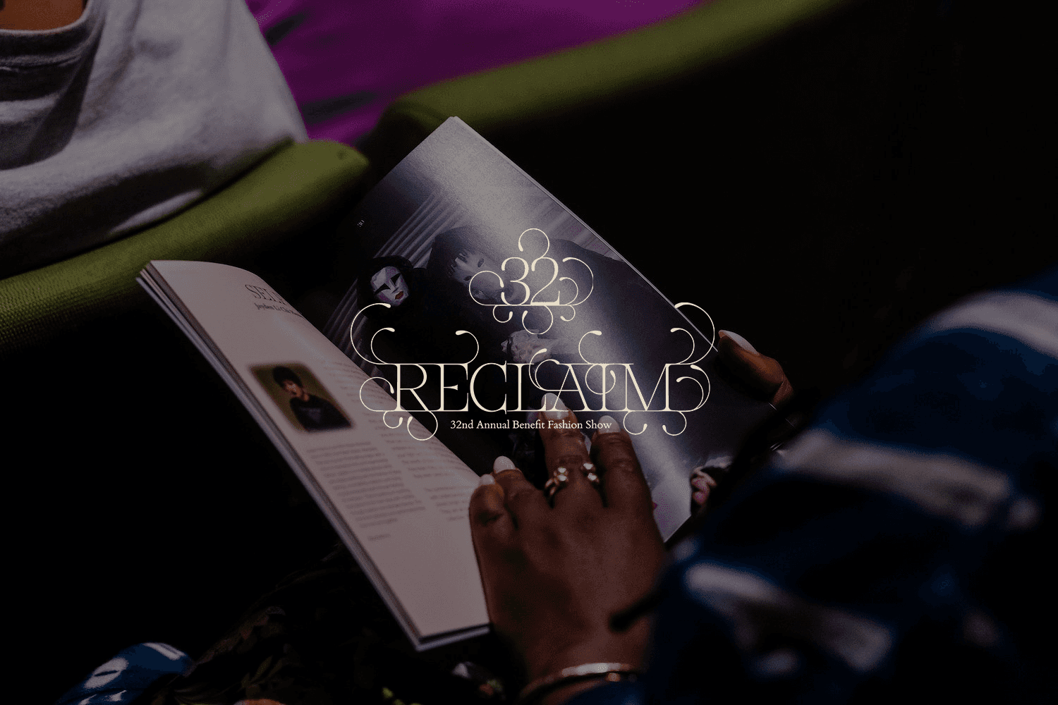
Reimagined 12'x 12' Gatefold vinyl design for Fall Out Boy's Save Rock & Roll Album with two fully illustrated vinyl sleeves.
Reimagined 12'x 12' Gatefold vinyl design for Fall Out Boy's Save Rock & Roll Album with two fully illustrated vinyl sleeves.
Year
2025
Year
2025
Year
2025
Collaborators
N/A
Collaborators
N/A
Collaborators
N/A
Category
Packaging
Category
Packaging
Category
Packaging
Project Duration
8 weeks
Project Duration
8 weeks
Project Duration
8 weeks
Intro
Save Rock and Roll has been woven into my life since I first heard it. The album's original cover captures something essential—a monk and a punk standing together, embodying the core truth of the record: that wisdom and rebellion aren't opposites, they're two sides of the same coin. I wanted to honor that duality by translating the raw, physical energy of the album into a digital medium. Spray paint strokes and bold silhouettes became vectors and layers, preserving the tactile defiance of the original while creating something that lives in both the analog and digital worlds.

Objective
Reimagine the Save Rock & Roll album cover for a 12-inch gatefold vinyl that captures the duality of monk and punk. The redesign needed to maintain the album's core identity and values while creating a cohesive visual system aligned with Fall Out Boy's contemporary aesthetic. The result had to work across vinyl dimensions, gatefold layouts, and any expanded physical media while feeling fresh and intentional.


Challenge
The original cover's strength—its raw, rebellious energy—risked feeling disconnected from how the album lives today. Translating tangible, physical elements like spray paint texture and silhouette contrast into a digital design required finding the balance between honoring the analog roots and creating something that feels current. The challenge was maintaining that visceral impact while designing for the constraints and possibilities of modern vinyl production and the band's visual evolution.

Result
The redesigned cover reclaims the album's visual identity with clarity and intention. By distilling the monk and punk duality into a bold, scalable system, the design works seamlessly across vinyl, gatefold, and digital formats. The updated visual language strengthens Fall Out Boy's brand presence while respecting the album's legacy—proving that a design can be both respectful of its past and confidently forward-looking.


Latest Projects


Packaging
Fall Out Boy Vinyl Redesign
Fall Out Boy Vinyl Redesign
Reimagined 12'x 12' Gatefold vinyl design for Fall Out Boy's Save Rock & Roll Album with two fully illustrated vinyl sleeves.
Reimagined 12'x 12' Gatefold vinyl design for Fall Out Boy's Save Rock & Roll Album with two fully illustrated vinyl sleeves.
Year
2025
Year
2025
Year
2025
Collaborators
N/A
Collaborators
N/A
Collaborators
N/A
Category
Packaging
Category
Packaging
Category
Packaging
Project Duration
8 weeks
Project Duration
8 weeks
Project Duration
8 weeks
Intro
Save Rock and Roll has been woven into my life since I first heard it. The album's original cover captures something essential—a monk and a punk standing together, embodying the core truth of the record: that wisdom and rebellion aren't opposites, they're two sides of the same coin. I wanted to honor that duality by translating the raw, physical energy of the album into a digital medium. Spray paint strokes and bold silhouettes became vectors and layers, preserving the tactile defiance of the original while creating something that lives in both the analog and digital worlds.
Objective
Reimagine the Save Rock & Roll album cover for a 12-inch gatefold vinyl that captures the duality of monk and punk. The redesign needed to maintain the album's core identity and values while creating a cohesive visual system aligned with Fall Out Boy's contemporary aesthetic. The result had to work across vinyl dimensions, gatefold layouts, and any expanded physical media while feeling fresh and intentional.
Challenge
The original cover's strength—its raw, rebellious energy—risked feeling disconnected from how the album lives today. Translating tangible, physical elements like spray paint texture and silhouette contrast into a digital design required finding the balance between honoring the analog roots and creating something that feels current. The challenge was maintaining that visceral impact while designing for the constraints and possibilities of modern vinyl production and the band's visual evolution.
Result
The redesigned cover reclaims the album's visual identity with clarity and intention. By distilling the monk and punk duality into a bold, scalable system, the design works seamlessly across vinyl, gatefold, and digital formats. The updated visual language strengthens Fall Out Boy's brand presence while respecting the album's legacy—proving that a design can be both respectful of its past and confidently forward-looking.
Latest Projects
Packaging
Fall Out Boy Vinyl Redesign
Fall Out Boy Vinyl Redesign
Reimagined 12'x 12' Gatefold vinyl design for Fall Out Boy's Save Rock & Roll Album with two fully illustrated vinyl sleeves.
Reimagined 12'x 12' Gatefold vinyl design for Fall Out Boy's Save Rock & Roll Album with two fully illustrated vinyl sleeves.
Year
2025
Year
2025
Year
2025
Collaborators
N/A
Collaborators
N/A
Collaborators
N/A
Category
Packaging
Category
Packaging
Category
Packaging
Project Duration
8 weeks
Project Duration
8 weeks
Project Duration
8 weeks
Intro
Save Rock and Roll has been woven into my life since I first heard it. The album's original cover captures something essential—a monk and a punk standing together, embodying the core truth of the record: that wisdom and rebellion aren't opposites, they're two sides of the same coin. I wanted to honor that duality by translating the raw, physical energy of the album into a digital medium. Spray paint strokes and bold silhouettes became vectors and layers, preserving the tactile defiance of the original while creating something that lives in both the analog and digital worlds.
Objective
Reimagine the Save Rock & Roll album cover for a 12-inch gatefold vinyl that captures the duality of monk and punk. The redesign needed to maintain the album's core identity and values while creating a cohesive visual system aligned with Fall Out Boy's contemporary aesthetic. The result had to work across vinyl dimensions, gatefold layouts, and any expanded physical media while feeling fresh and intentional.
Challenge
The original cover's strength—its raw, rebellious energy—risked feeling disconnected from how the album lives today. Translating tangible, physical elements like spray paint texture and silhouette contrast into a digital design required finding the balance between honoring the analog roots and creating something that feels current. The challenge was maintaining that visceral impact while designing for the constraints and possibilities of modern vinyl production and the band's visual evolution.
Result
The redesigned cover reclaims the album's visual identity with clarity and intention. By distilling the monk and punk duality into a bold, scalable system, the design works seamlessly across vinyl, gatefold, and digital formats. The updated visual language strengthens Fall Out Boy's brand presence while respecting the album's legacy—proving that a design can be both respectful of its past and confidently forward-looking.